Case study — Fintech / Institutional website
MODO.
Redesign of the institutional website for MODO, the digital wallet backed by more than 30 Argentine banks. As lead designer at Commute, I brought the app's visual language — its components and microinteractions — to the web, within a strict regulatory framework (Argentina's central bank, accessibility law).
Role
Lead Designer
Team
Commute · MODO
Industry
Fintech
Scope
Home, Promotions, Pay with MODO, templates
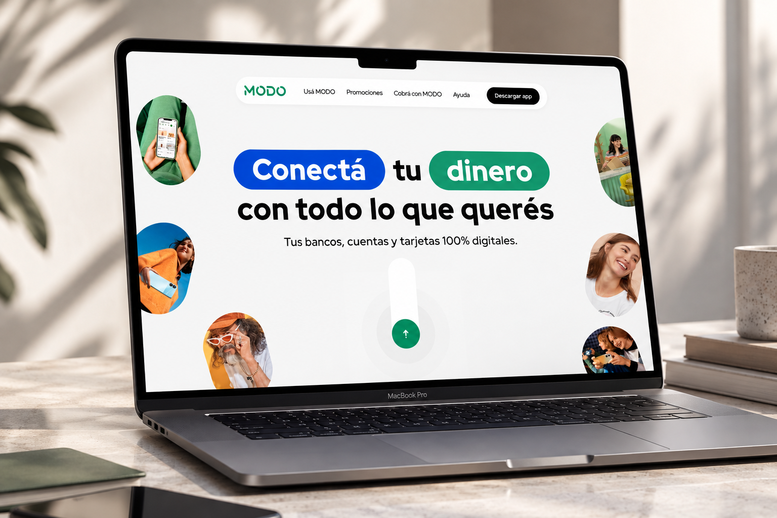
MODO · Desktop hero
01 / Context
A website that couldn't look as strong as the brand it represented
MODO is the digital wallet backed by more than 30 Argentine banks, with a strong presence on TV, social media and advertising. But its institutional website — redesigned by two agencies since 2020, and restructured at the information-architecture level by MODO's own team in 2022 — had fallen visually behind that brand.
The client's brief was specific: the problem wasn't information architecture (already defined and not meant to change), but purely UI. They needed a site that could match its direct competitors — Mercado Pago, Ualá, Personal Pay — with international references like Revolut and Bizum.
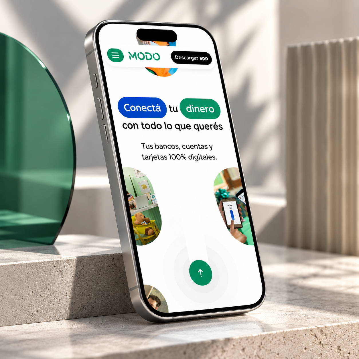
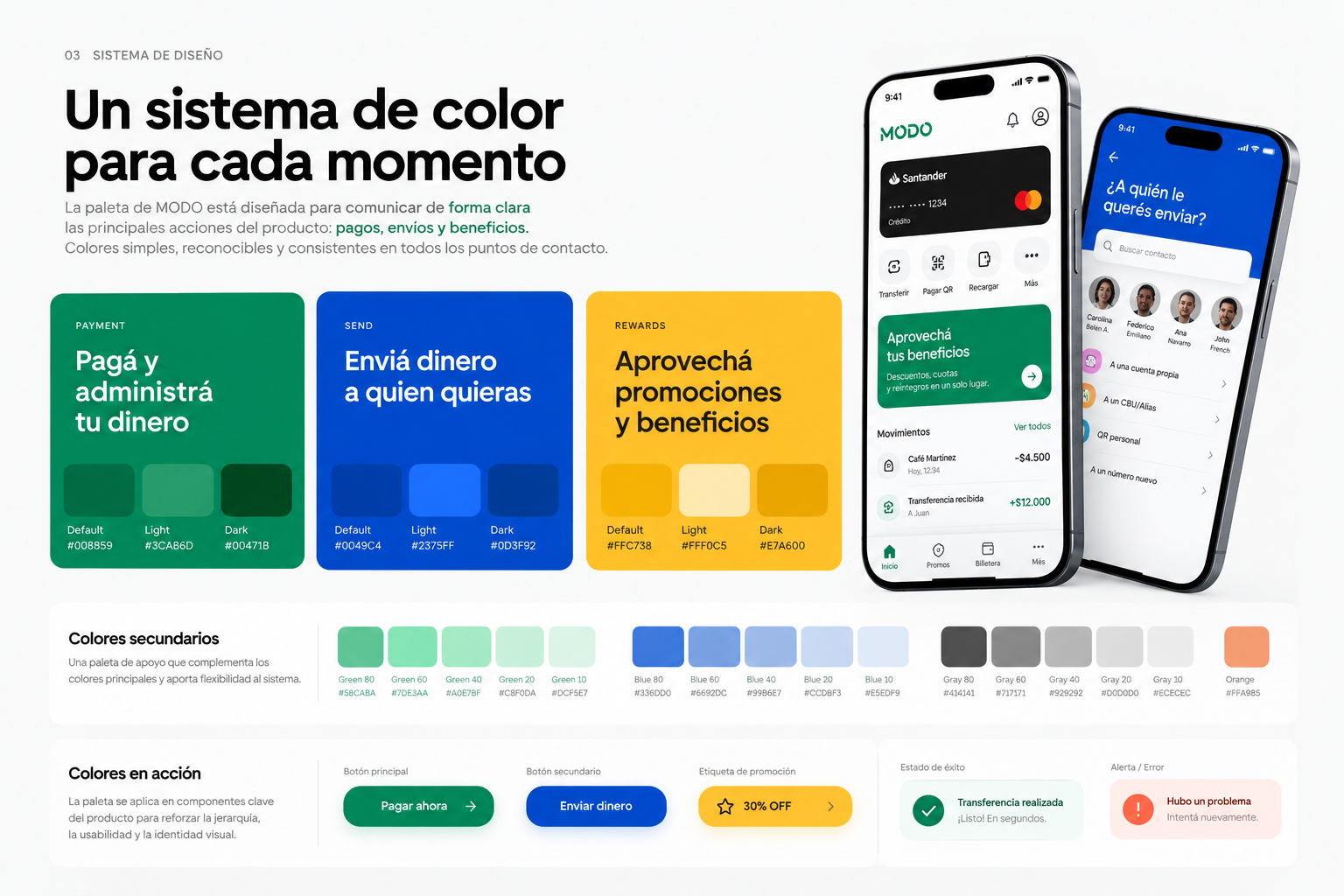
It wasn't about redesigning what the site said, but making it look and feel like the brand people already knew — without touching the structure MODO's team had already validated.
02 / Project constraints
Visual freedom, inside a strict regulatory framework
The brief wasn't purely aesthetic. MODO operates under Argentina's central bank (BCRA), and the site had concrete technical and legal requirements any visual proposal had to respect.
Accessibility
Compliance with Law No. 26,653 and BCRA Communications "A" 7517/2022 and "A" 7593/2022.
Brand consistency
Familiar to the app's design system in color and typography — not a new brand.
Implementation
Responsive across desktop and mobile (3 specific breakpoints), built to ship in Next.js.
03 / Product design
The app's language, on the website
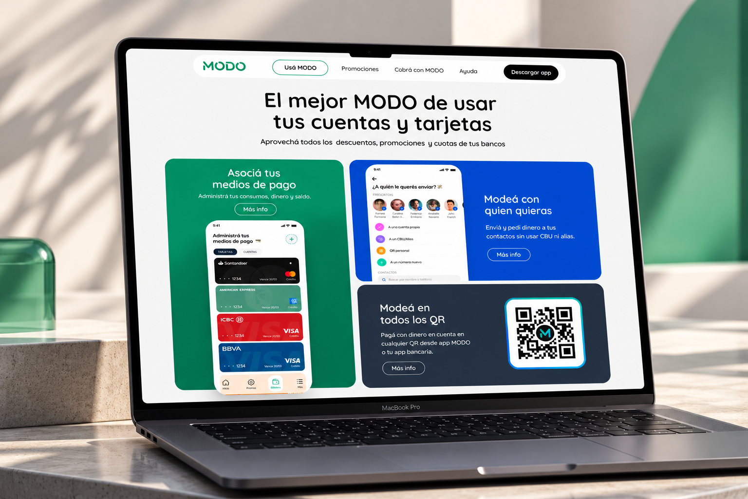
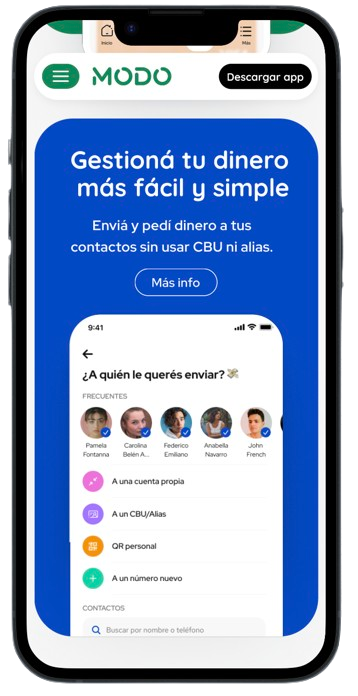
Each product block replicates the app's real components — payment-method cards, send-to-contacts and QR pay — with brand color tone by function.
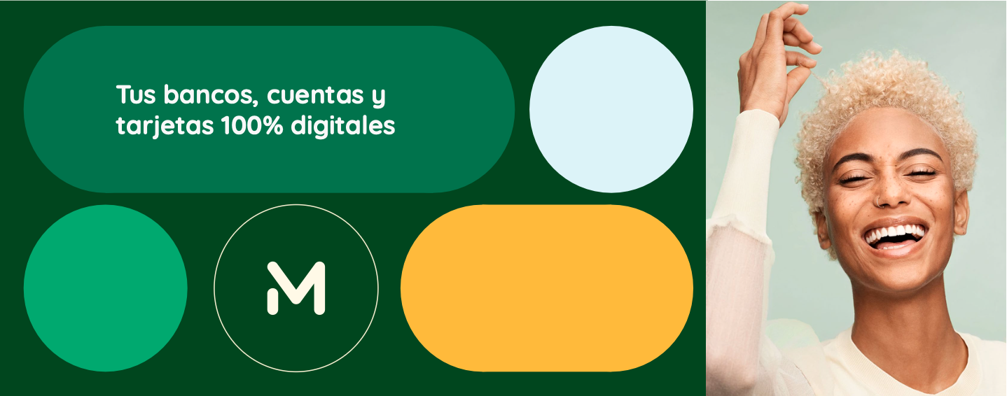
The hero keeps the campaign identity ("Conectá tu dinero con todo lo que querés"), but every block below it uses the exact same visual components a user would recognize from opening the app.
Associate your payment methods
Manage your spending, money and balance in one place.
Send to anyone
Send and request money to your contacts without CBU or alias.
Pay with any QR
Pay with account money at any QR from the MODO app or your bank's app.
04 / My role
Bringing the app to the website
As lead designer, the decision that defined the redesign was to take real components and patterns from the MODO app — cards, iconography, color tone by function — and translate them to the institutional site, adding microinteractions that gave it the same dynamism the brief asked for, without inventing a new visual language from scratch.
Web component system
A design system for the site itself (MODO·DS), familiar to the app's but adapted to an informational, non-transactional context.
Microinteractions
Motion and freshness added to static elements from the previous site, without compromising usability or accessibility.
Marketing templates
Reusable blocks (headers, feature presentations, text-and-image) so MODO's team could build landings without a designer each time.
Team
- Xavi Nadal — Lead Designer
- Evelyn Ricagno — PD Lead, MODO
- Federico Martínez Fraga
- Martín Nicolás Robledo
- Ezequiel Sanz
- Pedro Di Risio
- Juan José Perazzo
- María Paz Badino Mosquera
05 / Promotions
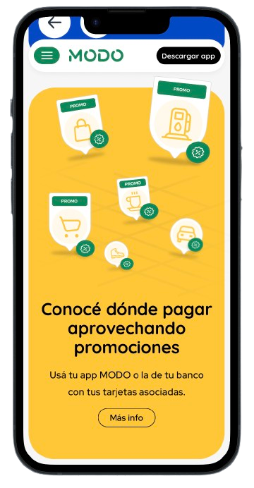
Same system, different job
The Promotions section had to solve a different problem: a filterable catalog of discounts, not a campaign landing page. The same component system was extended to support search, category filters and variable content grids.
06 / Wireframes
From wireframe to final design
The information architecture — already validated by MODO's team — was fully respected. The work focused on elevating the visual layer on top of that base.
07 / Outcome
From concept to production
Status
Design implemented and in production on modo.com.ar
Scope
Home, Promotions, Pay with MODO, and marketing templates
Client
Wallet backed by 30+ banks, direct competitor to Mercado Pago
"We loved the flexibility they had and the ability to turn all our ideas into something tangible, which enhanced our product."
Evelyn Ricagno — Product Design Lead at MODO
Source: Commute's LinkedIn post, with full project team credit.
Previous match
Kavak
Next match
MIIII
PRÓXIMAMENTE
Let's talk